| Key Points | Details to Remember |
|---|---|
| 📊 | Definition: a synthetic and interactive view of your data |
| ✅ | Benefits: speed, flexibility, and reliability |
| 🚀 | Steps: insertion, configuration, customization, refresh |
| 🎨 | Options: compact layout, outline, tabular, built-in styles |
| 🔧 | Tip: calculated fields, slicers, dynamic updates |
| 📈 | Applications: reporting, sales tracking, budget analysis |
If you have ever felt the frustration of scrolling for hours to understand an Excel file packed with rows, you are not alone. Last year, while preparing my team’s quarterly dashboard, I discovered that the pivot table could transform a heap of numbers into a clear report in just a few clicks. With the tangible sensation of clicking the “Insert” button and the sweet aroma of freshly brewed coffee by my side ☕, I saw my data come to life. In this article, we will explore together, step by step, how to create this famous table, configure it, customize it, and refresh it to get the most out of it daily.
Understanding the Pivot Table
What is a pivot table ?
A pivot table (PT) is an Excel tool that allows you to summarize large amounts of data in an interactive format. Rather than getting lost in complex formulas, you can drag and drop your fields into different areas (rows, columns, values, and filters) to instantly get totals, averages, counts, or other calculations. In short, it is the ideal solution to visualize, analyze, and present your data without coding.
Why use a PT ?
- Time saving: automation of grouping and calculations.
- Flexibility: ability to rearrange fields on the fly.
- Reliability: little or no risk of formula errors.
- Visual clarity: dynamic and interactive reports.
Preparing Your Data for a PT
Structuring the source
First of all, make sure your data range is an Excel table or a named range. Each column must have a unique header, free of merged cells or empty rows. If you have used SUMIFS elsewhere to consolidate certain values, keep in mind that a PT can often replace several calculated columns by directly grouping your conditions.
Cleaning and formatting
A sweep to remove duplicates, a uniform date format, a few filters applied… and your source is ready. Don’t hesitate to use sorting or an advanced filter to isolate outlier rows. The cleaner your data, the more relevant the result will be.
Step-by-step guide to creating a pivot table
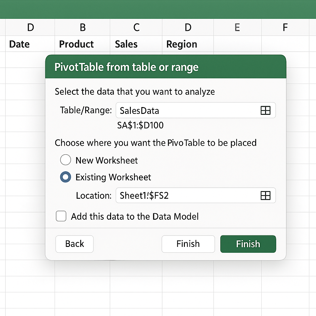
1. Inserting the Pivot Table
Select a cell in your source range, then go to the Insert tab > Pivot Table. A dialog box appears: check the range, choose to insert the pivot table in a new sheet or an existing location, then confirm. At this stage, Excel presents you with the field pane, ready to use.
2. Configuring the fields
The configuration pane consists of four areas:
- Rows: groups the items to display vertically.
- Columns: organizes the horizontal headers.
- Values: calculation area (sum, average, count…). You can even count using COUNTIFS or COUNTIF for conditional totals.
- Filters: to dynamically exclude or include certain data.
Drag and drop your fields and watch the pivot table build in real time. You can combine multiple row fields (for example, product then region) to get a multi-level view.
3. Customizing the display
Once the structure is in place, it’s time to refine the presentation:
| Layout | Advantage |
|---|---|
| Compact | Saves space, implicit hierarchy |
| Outline | Displays each level distinctly |
| Tabular | Independent columns, more readable when printed |
In the Design tab, try different styles and toggle grand totals on or off. You can even use VLOOKUP in the background to retrieve more complete labels before feeding your pivot table.
4. Refreshing and updating
If your database changes, no need to recreate everything: simply click Refresh in the Analyze tab (or contextual tab depending on your version). If you modified the source table structure (added columns), use Change Data Source to include the extended range.
Advanced tips and tricks
Calculated fields and slicers
Tip: create a calculated field for a growth rate directly in the pivot table, without touching the raw data!
In PivotTable Tools > Fields, Items & Sets > Calculated Field, you can write your own formulas based on existing fields. To refine your filters, slicers are ideal: a mini interactive table that allows switching from one category to another with a click.
Pivot charts
A pivot chart is an excellent complement to visualize your results. From the Analyze tab, select Pivot Chart and choose the chart type (bars, lines, pie…). Filters and slicers remain synchronized, for impactful presentations.
FAQ
- What type of data can be analyzed with a Pivot Table?
- Any tabular dataset: dates, numbers, texts. Avoid mixed areas or merged cells.
- How to automatically refresh the Pivot Table when opening the file?
- Check the “Refresh data when opening the file” option in the Pivot Table properties.
- Can I add a custom calculation without modifying my data?
- Yes, via calculated fields accessible in the Pivot Table ribbon.
- Is it possible to export a Pivot Table to PowerPoint?
- Of course: copy the Pivot Table or the Pivot Chart and paste it into your slide.